Here’s a graph:
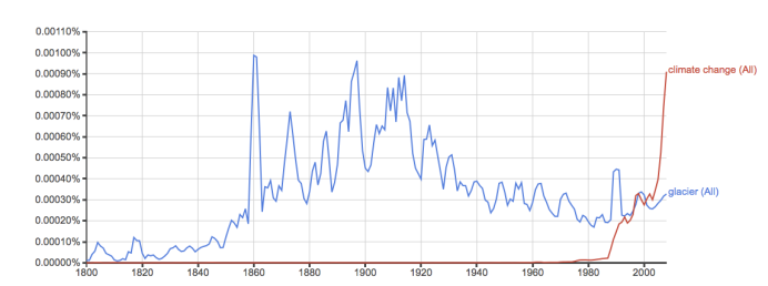
Before I tell you what it is, I want you to give it a guess (I promise I’ll tell you what it is). Almost insignificant until 1850, the variable rises in dramatic fashion towards the end of the 19th century with a few great peaks. Into the 20th century there is a pretty dramatic dip during WWI in the late 1910s, although by this point our blue variable is already in steady decline. It bottoms out in the 1980s, but except for a short spurt around the end of the 1980s (I can only assume it’s directly related to my birthday), seems to be holding pretty steady (perhaps rebounding slightly towards present day).
Our second variable, in red, is pretty insignificant until the late 1980s. It explodes about the same time our blue variable makes a jump, but instead of levelling off, it continues to grow exponentially.
Have you guessed it yet? Spoiler Alert:
The graph is taken from Google Ngram Viewer, and is the percent abundance of the word “glacier” (in blue) and “climate change” (in red) in American English written literature, over time.

Ngram. See it here.
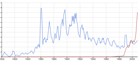
The reason I bring it up, is for a couple reasons. First, it’s not really what I would have expected. I would have thought, given climate change, polar vorticies, Inconvenient Truths, and Chasing Ice that we’d actually be talking (and writing presumably) more about glaciers now than ever. However, the Ngram trend kind of reminds me a little of this shape:
Perhaps we simply write about what’s around us? Incidentally, the second reason I bring this up (and bothered screwing around on Ngrams in the first place) is that a new batch of data for the 2011/2012 season has come out from the World Glacier Monitoring Service, which amalgamates and compiles glaciological observations from around the world. From WGMS:
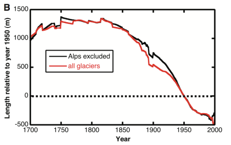
The average mass balance of the glaciers with available long-term observation series around the world continues to be negative, with tentative figures indicating a further thickness reduction of 0.6 metres water equivalent (m w.e.) during the hydrological year 2012. The new data continues the global trend in strong ice loss over the past few decades and brings the cumulative average thickness loss of the reference glaciers since 1980 at 16 m w.e.
In case you needed some reminding, here’s a graph of how much ice we’ve lost from our surveyed glaciers:


Great stuff. I’ve been playing with ngrams and climate related issues lately and will eventually post about a hundred of them.
By the way, that was WW I in the 1910s. Easy typo to make.
whoops! That’s embarassing… Thanks Greg – fixed it.